We are checking out Tink widgets in a series of posts. Let’s get introduced to another important Basic widget, i.e. Text widget.
Text is a common widget that displays the text content of an application. Text can be displayed in a single line or multiple lines.
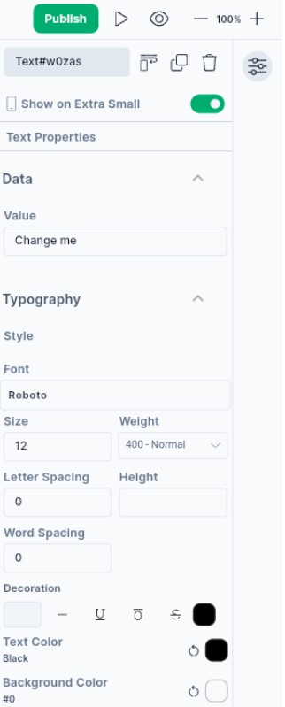
Let’s check the properties of the Text widget…
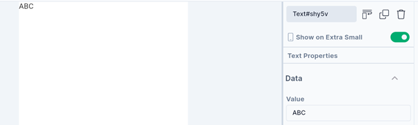
The Value displays the Text content.
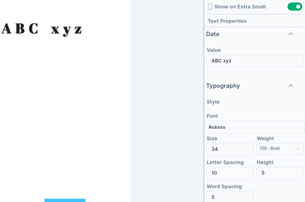
**Text style sets the Font, thickness (weight), and size of the text. With letter spacing, it creates space between two letters. It also sets the height of the text widget if we provide height in pixels. Word spacing creates space between two words.
You can also decorate the text with overline, underline, and strikethrough lines. You can also set the thickness and color of these lines. You can also undo this Decoration by choosing None (-)
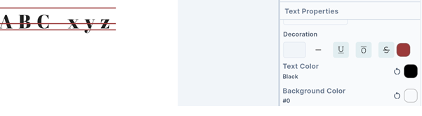
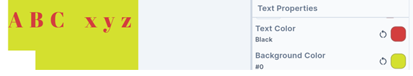
You can set the text color and background color of your choice.
Let’s check the remaining properties one by one!

- Set the text alignment - Start, Centre, End, Justify, Left, or Right.
- Set the Text direction as Left to Right or Right to Left.
- There is a provision to handle a visual overflow of text. Clipping or fading the overflowing text, adding an ellipsis (…) at the end, or making overflowing text visible outside the container are some of the options to tackle the overflow of text.
- Softwrap checks whether the text should break at soft line breaks.
- The Text Scale Factor defines the number of font pixels for each logical pixel. If the factor is 1.5, the text font would be 50% bigger than the specified font size.
- MaxLines sets the maximum number of lines for the text content. It wraps the text if necessary.
The Text widget is an important widget with widespread usage across various kinds of applications.
We will see more Tink widgets in future posts!
You may also check out the Flutter Rich Text widget below.
Disclaimer: The attached video is from @flutterdev who is not associated with Hypi.