In a series of posts on Tink widgets, let’s check out a Button widget, i.e. Elevated Button widget.
Elevated Button has a raised appearance and other elements on the screen are generally flat.
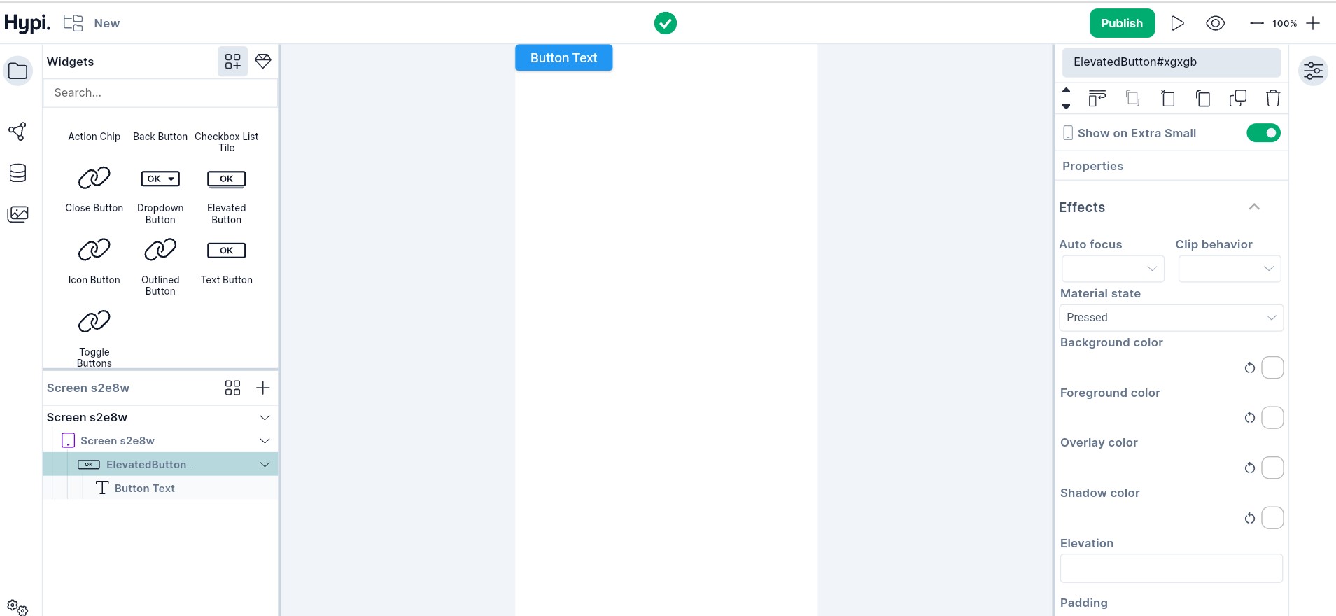
Let’s check the properties of the Elevated Button widget.
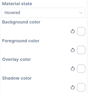
- For Button states like default state, mouse hovering, focus state, pressed state, and disabled state, the color of the button can be set.
-
Background color => The background of the button.
-
Foreground color => The child widget color on the button.
-
Overlay color => The mouse hovering over the Button
-
Shadow color => Shadow color of the button
-
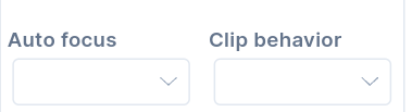
If the Autofocus is set to true, the Button will get initial focus from the keyboard.
-
If the content overflows the widget boundary, then clipping can be done.
-
Anti Alias - Clipping the edges to have a smoother look.
-
Anti Alias with Save Layer - Clipping with anti-aliasing and saving the Layer immediately following the clip. This process is slower than Anti Aliasing and is rarely used.
-
Hard Edge - The fastest clipping with low fidelity. No anti-aliasing, or smoothening of edges applied.
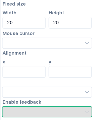
- As described earlier, the Alignment** places the child Text widget at a certain position inside the parent widget boundaries. The Position can be Bottom Center, Bottom Left, Bottom Right, Center, Center Left, Center Right, Top Left, Top Right, Top Center, etc. Choose the child widget position inside the button appropriately.
- Width and Height fix the size of the Button.
- To enable acoustic and/or haptic feedback, set Enable Feedback to true. For example, a clicking sound and a long press with short vibrations can be enabled.
Change the Button Text properties of the child widget. We have seen Text properties in the previous post.
The Elevated Button widget is an important widget that captures the user’s attention.
We will see more Tink widgets in future posts!