
In the previous post, we have covered Text widget in the Introduction to Tink Widget Series.
Let’s check out the Container widget now…
Container is a layout widget that is used to position the child widgets on the screen. It also provides shape to the child widget. It facilitates common painting, decorating, positioning, and sizing its child widget.
Let’s check the properties of a Container widget!
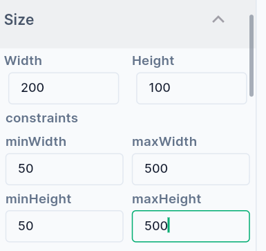
- Size the Container by providing Width and Height in terms of pixels.
- Set Minimum and Maximum width and height values. This helps to set the constraint limits on the dimensions of the Container.
-
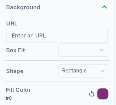
Provide fill color value to change the background of the container.
-
It is also possible to set an image as a background. Provide an image URL to upload the image in the background.
-
Container can be rectangular or circular.
-
Experiment with BoxFit values to fit the child widget into the container.
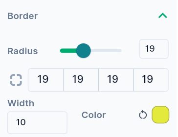
- Provide Radius values to the corners of the rectangle to make them circular.
- Width of the border can be adjusted by providing width value in pixel. Color can also be given to the border.
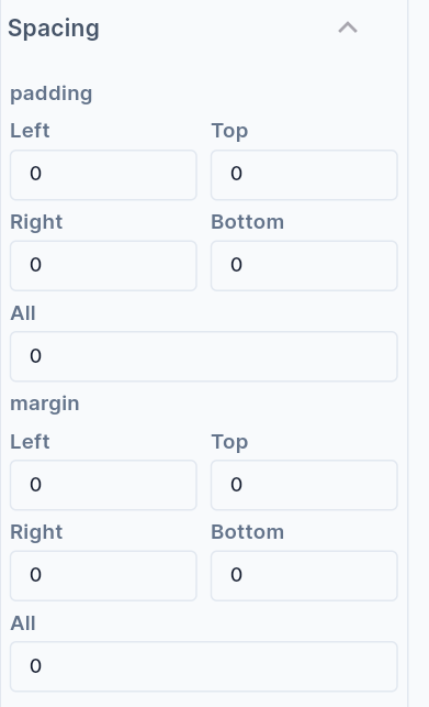
- Provide Margin values to create space around the outer border of the Container.
- Provide Padding values to create space between the child widget and the outer border of the container.
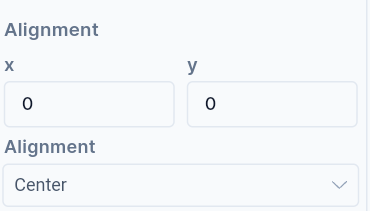
- The Alignment** places the widget at a certain position inside the parent widget boundaries. The Position can be Bottom Center, Bottom Left, Bottom Right, Center, Center Left, Center Right, Top Left, Top Right, Top Center, etc. Choose the child widget position inside the button appropriately. X and Y coordinates can also be provided to position the child widget.
We will see more Tink widgets in future posts!
You may also check out the Flutter Container widget below.
Disclaimer: The attached video is from @flutterdev who is not associated with Hypi…