Let’s start with Introduction to Tink Widget Series to know more about Tink widgets. All the Tink widgets will be described in a series of posts.
Tink widgets correlate with Flutter widgets because Tink is a flutter-based application. So you may find the link below to the corresponding Flutter widget.
Now we will start with the first widget of the series, i.e. Icon.
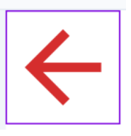
Icon is a Basic widget that is visible across various kinds of applications. Icon is a visual representation of Text, Event, Program, or any Thing.
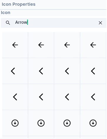
You can search for Icons from Hypi Tink’s Icon Collection which holds hundreds of icons.
You can set the Size and Color of the Icon with ease. Enter the size in pixels and choose the Color by clicking on the Color icon on the right side.

Grade and Weight properties decide the thickness of the symbol. The Grade is the granular stroke weight for drawing the icon. The weight property means the weight of the Stroke while drawing the symbol.
You can attach a Semantic label to the Icon as well. Also, change the Direction of the symbol by choosing Right to Left or Left to Right.
The Icon is the simplest Tink widget to know. Just play around and try adding various Icons on the Screen.
We will see more Tink widgets in future posts!
You may also check out the Flutter Icon widget.
Disclaimer: The above video is by @FlutterMapp who are not associated with Hypi.