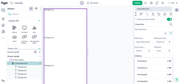
In this post, we will take a look at the Column widget.
The Column is a layout widget that accommodates multiple widgets in a vertical array. You can add multiple child widgets in a column till they fill available space.
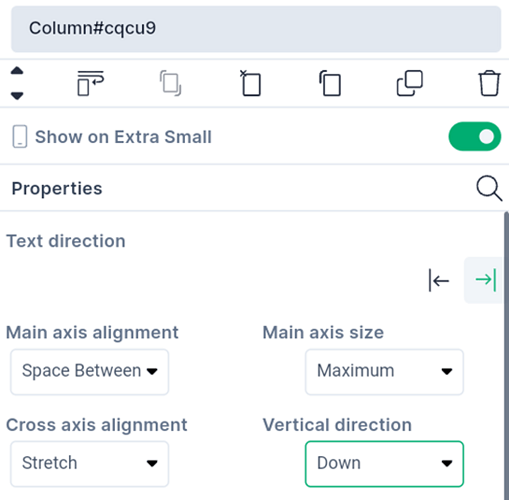
Let’s check the properties of the Column widget.
-
Change the Text Direction from Right to Left or Left to Right.
-
Main Axis Size determines the amount of space to be occupied by the widgets on the main axis. Free space might remain after allocating space to the widgets. With the Min settings, the amount of free space gets minimized. With the Max settings, it gets maximized.
-
Main Axis alignment places the children along the main axis of the Column using the below alignment values. The values are described here.
-
The horizontal axis is the cross-axis for the column. Cross-axis alignment places the child widgets along the cross-axis as per the provided values. The values are described here
-
Vertical direction can be chosen as up or down to rearrange the child widgets in the column
We will see more Tink widgets in future posts.
Check more about positioning of children…

