Design user interfaces with Hypi Tink: no-code way!
We are happy to introduce you to Tink- Hypi’s latest product to design mobile and web apps.
With TInk, You can quickly design an interface with simple drag-and-drop widgets. Tink’s basic building block is a widget. A user interacts with the widget on a screen.
Add widgets on a screen. Simply rearrange, resize, and color them to design a user interface with no code.
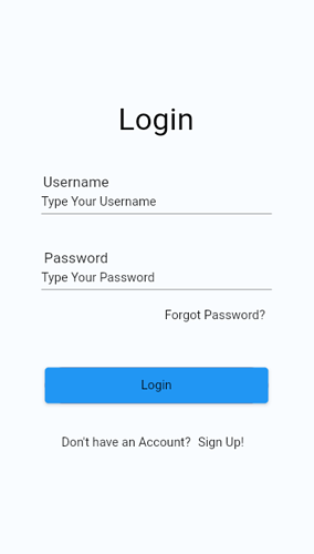
In this first post on designing with Tink, we will see how to create a Login page. This is our basic format of a Login page. We will see what kinds of widgets we need to build this and how to arrange and resize them.
Use Basic Widgets like Text, Text Field, Elevated Button, Text Button, etc. to design the above Login screen. Position and resize the basic widgets using Layout widgets like Column, Row, Padding, Container, etc.
Let’s look at these widgets one by one!
-
Text: Static widgets for visual display and to provide information in text format. Users can not interact with these widgets.
Login,Username,Password, andDon’t Have an Account?are static Text widgets.
You may change Text Properties like Value, Font, Weight, Size, Alignment, Color, emphasis, etc. -
Text Field: Accept and process user inputs from hardware or onscreen keyboard.
Type your UsernameandType your Passwordare the text fields where users will enter Username and Password for login.
You may change the Text Field properties like Value, Font, Weight, Size, Alignment, Color, etc. You may also customize the border for enabled, disabled, and focused states. -
Elevated Button: Provides raised appearance and captures the user’s attention. When a user clicks on the button, an action gets executed.
Loginis an elevated button. Clicking this button logs in the user to the app and takes him to another screen. -
Text Button: Flat button with a text display. An action gets executed when the user clicks the Text.
Forgot Password?andSign Up!are the text buttons. Other screens open up when these buttons are clicked.You can customize the appearance of both types of buttons.
Let’s move to Layout widgets that are used to arrange the above Basic widgets on the screen.
-
Column: This is a default Layout widget for a screen. It arranges multiple widgets in a vertical array. Login, Username, Username text field, Password, Password text field, Forgot password, Login button with Container, and a row widget are arranged vertically in a Column.
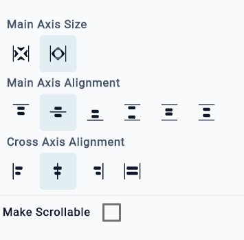
We need to adjust axis alignment to place the widgets on the screen. Here we’ve keptCenteralignment for Main axis and Cross axis. And then adjusted padding values to create space around widgets.
-
Row: It arranges multiple widgets horizontally. Static Text
Don’t Have an Accountand Text ButtonSign Upare arranged in a row. -
Container: It is used to position and size the widget. We are placing the
Loginbutton inside Container and then adjusting its width and height. -
Padding: We use Padding to adjust the empty space around the widgets. You can provide space on all sides or any one side. For example, we’ve added padding at the bottom of
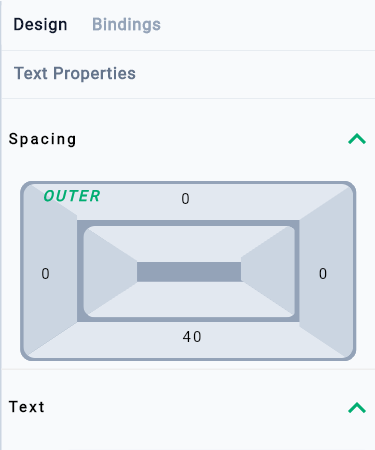
Loginstatic text to create space around Login text and Username Text.
Steps to design the Login page
- Add Text widget on the screen by dragging it on the Screen from the Left-hand side Widgets panel. It will be added as the first widget in a Column.
- Change its value to
Loginfrom the right-hand Properties Panel. - Change the appearance of the text by changing Properties like Theme, Size, Height, Color, etc. Use the right-hand Properties panel to change the Properties.
- Add the second Text widget to the screen by dragging it and changing its value to
Usernamefrom the Properties Panel. Also, change other properties from the panel as per the requirement. - Add the Text Field widget to the screen and change its value to
Type Your Username. Change the properties like Theme, Color, Border, etc from the right-hand panel. - Add the third Text widget to the screen by dragging it and changing its value to
Passwordfrom the Properties Panel. Also, change other properties from the panel as per the requirement. - Add another Text Field widget to the screen and change its value to
Type Your Password. Change the properties like Theme, Color, Border, etc from the right-hand panel. - Add Text Button on the screen and change the value to
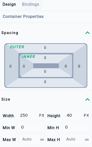
Forgot Password?. Also, change the appearance of the widget from the Properties panel. - Add the Container widget on the screen and change its size to fit the child widget. (Width 250 PX and Height 40 Px)
- Add Elevated Button inside the container by dragging it to the position of the container. If the button gets placed outside the Container, you may drag it on the Navigator (Left-hand bottom corner) and drop it on the label
Container. Change the background color of the button from the Properties Panel. - Click on the Text placed on the button and change the Text value to
Login. Customize the appearance of the button Text from the Properties panel. - Add a Row widget on the screen by dragging it from the Left-Hand side Layout Widgets section.
- Add a Text widget inside the Row widget and change its Text value to
Don’t have an Account?. - Add the Text Button widget inside the Row widget which will be placed horizontally after the previously added Text widget. Change the Text Value to
Sign Up!and change the appearance of the Text from the Properties panel. - All the widgets will be added in a column vertically one after the other. Keep Main Axis Size as
Maxand Main axis and Cross Axis alignment asCenter. This will place all the widgets in the center one after the other. Now, we need to place them apart by adding Padding values. - Click on the
LoginText. Click on the Spacing label on the Spacing rectangle on the Properties panel. Click on the0value on the bottom side and enter a value40to create a 40-pixel distance between theLogintext andUsernameText. - Click on the
UsernameText. Click on the Spacing label on the Spacing rectangle on the Properties panel. Click on the0value on the right side and enter a value180to push theUsernametext to the left side. - Click on the
Type Your UsernameText Field. Click on the Spacing label on the Spacing rectangle on the Properties panel. Click on the0value on the right side and enter a value50. Click on the0value on the left side and enter a value50. This will size the Text Field and place it in the middle. - Click on the
PasswordText. Click on the Spacing label on the Spacing rectangle on the Properties panel. Click on the0value on the right side and enter a value180to push thePasswordtext to the left side. Click on the0value on the upside and enter a value40to create a 40-pixel distance between theLogintext andUsernameText. - Click on the
Forgot PasswordText Button. Click on the Spacing label on the Spacing rectangle on the Properties panel. Click on the0value on the left side and enter a value130to push the button to the right side. Click on the0value on the upside and enter a value20to create a 20-pixel distance between theType Your Passwordtext field and the Text Button. - Click on the
Rowwidget. Click on the Spacing label on the Spacing rectangle on the Properties panel. Click on the0value on the upside and enter a value30to create a 30-pixel distance between Row and Elevated ButtonLogin.
Observations
-We’ve usedCentreaxis alignment. You may experiment with other Column Properties to position the widgets.
-You may useSizedBoxinstead ofContainerto resize the Elevated Button.
-Padding values will depend upon your own requirements.
That’s the end of our first guide on designing Login page with Hypi Tink – No code way! Do give it a try to design your own Login page!
Please let us know your valuable feedback about the experience of using Tink to improve the product.
Hypi is happy to help with the implementation of your Mobile or Web applications!
