In the previous post, we designed a Login page using Tink.
Let’s move on to designing the Sign Up page no-code way using Tink.
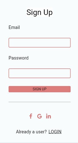
This is the basic format of a Sign Up page that we usually see on mobile / web apps.
We will need Basic widgets like Text, Text Field, Elevated Button, Text Button, Divider, Icon button, etc. To position the Basic widgets, we will need Layout widgets like Column, Row, Container, etc.
Let’s build the page step by step.
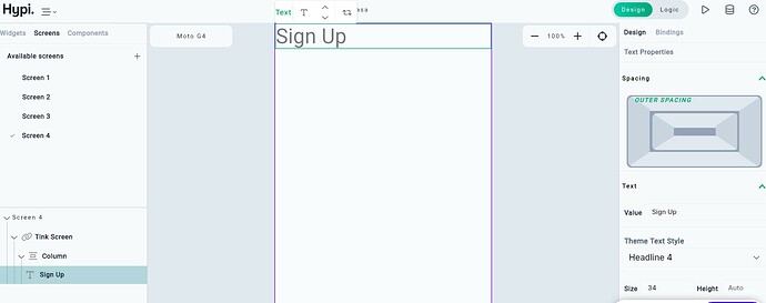
Add the Text widget by dragging it from the Widgets panel to the screen. Provide Theme style as Headline 4 and change the value to Sign Up. Text Size will get automatically adjusted.
You can change the property of the widget by selecting the widget from the screen or Navigator and changing the settings from the right-hand side Properties panel.
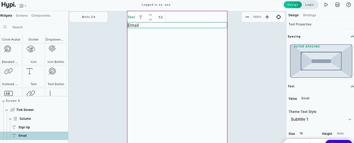
Add another Text widget. It will be added vertically in a column just after the Sign Up text. Change the value to Email
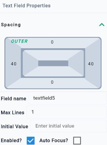
Add Text Field widget after that. Text Field will have an infinite width and it will cover the width of the screen. Provide left and right spacing of 40 pixels and it will get contained within the screen.
Click on the spacing rectangle and enter 40 by clicking the initial 0 value of the right and left sides of the rectangle.
Users can enter the Email value in this text field using a physical or onscreen keyboard.
Next, we will provide round border to the Text Field. Provide a Radius of 5 pixels and the corners of the Text Field will get rounded with a Radius of 5. Provide a border width of 2 pixels.
You may enter similar kinds of settings for the focused border, enabled border, error border, etc.
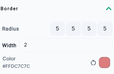
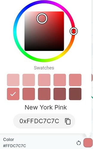
Change the color of the border by clicking on color settings. A color box pops up. You may enter the RGB value (DC7C7C) by clicking on the edit box or choosing the color from the panel. Apply the same color to other Text Field widgets and Buttons.
Add another Text widget with the value Password followed by a Text Field widget. Apply the same settings as described above.
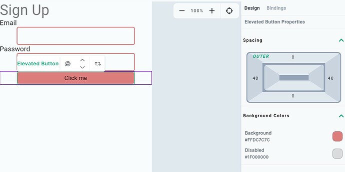
Add Elevated Button widget and provide left and right spacing of 40 pixels. This will ensure the alignment of Text Field widgets and the button. Change the text value of the button to SIGN UP.
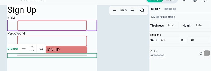
Next, we have a divider line below the Elevated Button. Add the Divider widget by dragging it from the Widgets panel.
Again provide left and right padding of 40 pixels.
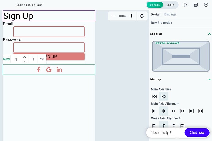
Add a Row Layout widget and place three Icon Button widgets alongside each other.
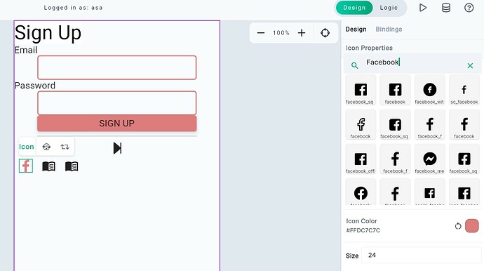
Search Facebook under Icon properties and select the Facebook icon. Change the color of the icon as well.
Similarly, change other icons by searching Google and Linkedin.
Change the Row Properties to keep the icons at the Centre. Set Main Axis Size as Max and Main and Cross Axis alignment as Centre.
Add another Row Layout and add Text and Text Button widgets alongside each other with Centre alignment as before.
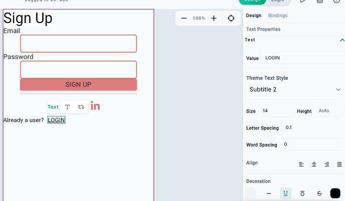
Change the value of the Text widget to Already a User?. Also, change the text value of the button to LOGIN. Make the text underlined by clicking underlined U from the Decoration section of the Text Properties.
Now we will change the alignment of the Text. Make the Sign Up text (from the top) center-aligned from the Properties panel. Also, set the axis alignments to Centre for the last Row with the Text and Text Button.
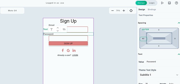
Provide 40 pixels spacings on the Left side for the Email and Password Text widgets. This will ensure the alignment of Text Field widgets and corresponding Text widgets.
Now we will position the widgets on the screen. Select the column where all widgets are placed.
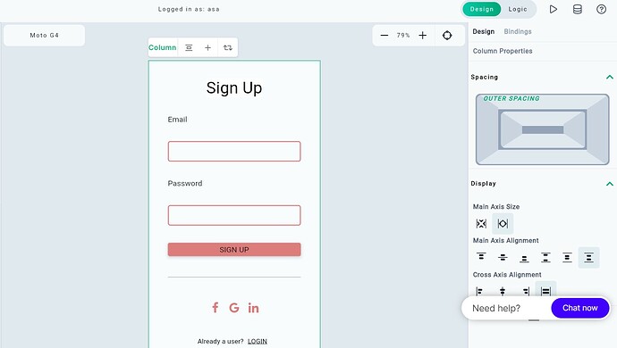
Change Main Axis Size as Max and keep Main axis alignment as Space Evenly. This will ensure vertically equal spacing between the widgets.
Change Cross Axis Alignment to Stretch. This will stretch the Elevated button to align with the Text Fields.
At last, adjust the Theme style of the Text widgets. You may keep the Email, Password, and Sign Up text style to Headline 6. It depends upon your design how to style the Text.
This completes our design of the Sign Up page. Isn’t it simple?
Do try to design your Sign Up page - with No Code!
Your valuable feedback is appreciated to improve our product.
Hypi is happy to help with the implementation of your Mobile or Web applications!
