In the previous post, we have seen no code way of designing a Sign Up page using Tink.
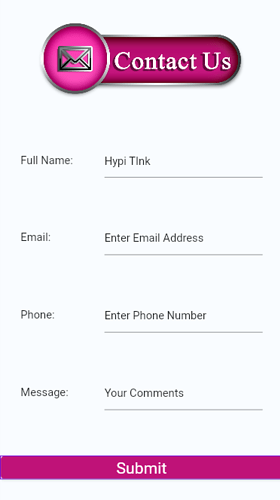
In this post we will see a simple Contact Us page design using Tink.
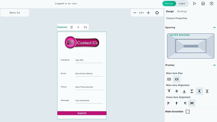
Let’s design the below Contact Us page.
We will need Basic widgets like Text, Text Field, Elevated Button, Tink Image. etc. To position the Basic widgets, we will need Layout widgets like Column, Row, Container, etc.
Here are the steps to build the Contact Us page.
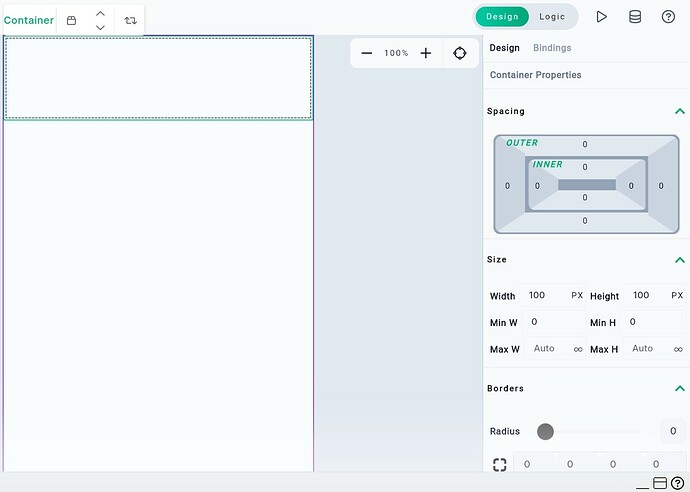
- Drag Container widget from the Layout section of the Widgets panel to the screen. Keep the container size 100 100* pixels.
-
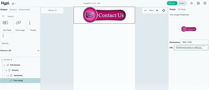
Add Tink Image widget to the Container.
-
Change the property of the widget by selecting the widget from screen or from Navigator and changing the settings from the right hand side Properties panel.
-
Insert the URL of the Image to be uploaded. The size of the image gets automatically adjusted and the image fits inside the container.
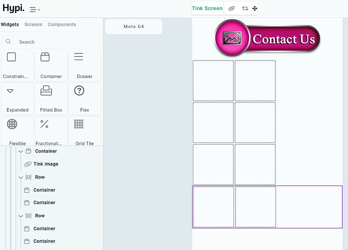
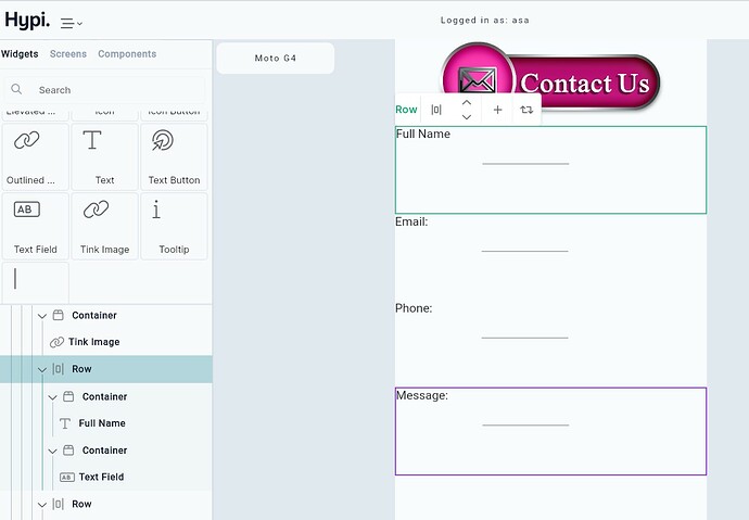
- Add four Row widgets one after the other in a vertical column. Then add two Container widgets inside the Row widgets. The container widgets will shape the Text and Text Fields we have on the Contact Us page.
-
Add Text widget in the first Container on the Row and Text Field widget in the second Container.
-
Change the Text Values of the Static Text as shown in the image below.
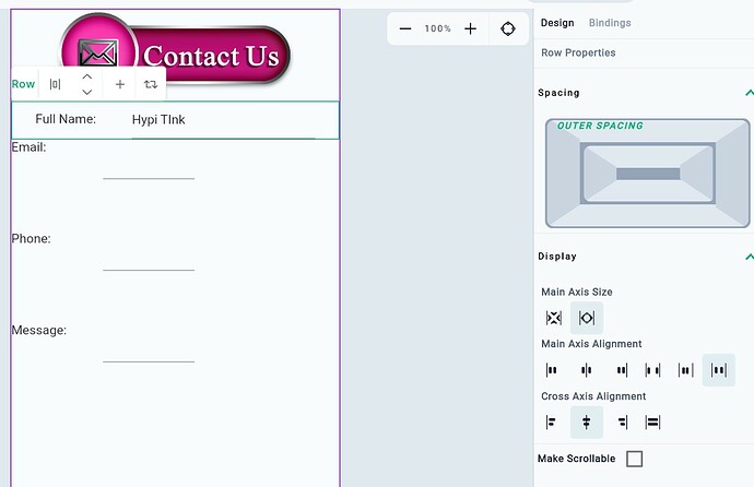
- Change the place value of Text Fields from the Properties panel. Also, change the properties of all the Row widgets to align the Text and Text Field widgets. Set Main Axis Size as
Max. Keep Main Axis alignment asSpace Evenlyand Cross Axis Alignment asCentre. But this will not make the Text of the widgets centrally aligned. We need to make a few more adjustments.
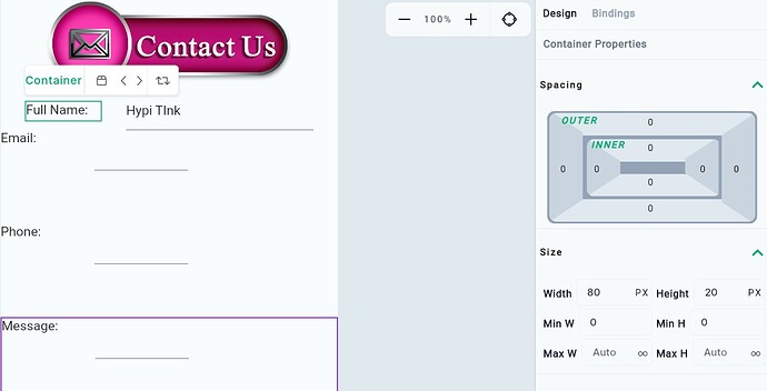
- Change the Height and Width of all the Containers of the Text widgets in the Row as follows.
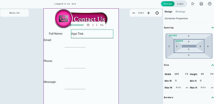
- Change the Height and Width of all the Containers of the Text Field widgets in the Row as follows.
-
Adjusting the Container size like above will make the text of the Text and Text Field widgets centrally aligned. You may have to play with the Container size a little to align the Widgets.
-
Add an Elevated Button widget below the last Row. Change the color of the Button matching with the color of the Image on the Top. Also style the Text on the Button. Check the previous post for changing the Color of the widgets.
Now let’s position the widgets on the screen. Select the column where all widgets are placed.
-
Change Main Axis Size as
Maxand keep Main axis alignment asSpace Around. This will ensure vertically equal spacing between the widgets. And it will also place half of this space before and after the first and last widget. -
Change Cross Axis Alignment to
Stretch. This will stretch the Elevated button to align with the Text Fields.
Now our Contact Us page is ready!
Observations
-You may use Sized Box to size the Text and Text Fields instead of the Container.
-You may use Padding to adjust Space between the widgets.
-You may add Tooltip to Text Field widgets.
It is now your turn to design your Contact Us page - with No Code!
Share your designed Contact Us page with us. We will contact you using the same page 
Hypi is happy to help with the implementation of your Mobile or Web applications!
